간략히 메뉴얼 정리
<krpano version="1.19" onstart="loadscene(scene1);">
  <scene name="scene1">
  ...
  </scene>
</krpano>
이것은 krpano xml 파일의 주 / 루트 요소입니다.
이 요소 내에서 모든 추가 xml 요소를 정의해야합니다.
<preview url="preview.jpg" />
<preview type="grid(CUBE,16,16,512,0xCCCCCC,0xFFFFFF,0x999999);" />
전체 / 전체 파노라마 이미지를로드하는 동안 표시 될 작은 '미리보기'파노라마 이미지로 URL / 파일 이름을 정의하십시오. 이 미리보기 이미지는 빠른로드가 가능하도록 파일 크기와 이미지 크기가 작아야합니다.
CUBE
<image>
    <cube url="pano_%s.jpg" />
</image>- CUBE
입방 형 파노라마 이미지 - 6 이미지, 큐브 측면 당 하나의 이미지.
<image>
    <cubestrip url="cubestrip.jpg" />
</image>- 큐브 스트립
하나의 단일 이미지에서 '이미지 스트립'과 같은 입방 파노라마 이미지. 지원되는 이미지 주문은 6x1, 1x6, 3x2 또는 2x3입니다. 큐브 쪽에서 이미지까지 지정은 스트립설정 을 통해 수행 할 수 있습니다 .
<image>
<image>
    <sphere url="pano.jpg" />
</image><image>
<cylinder url="pano.jpg" />
</image>| Attribute name | Full variable name | Type | Default value |
| hfov | image.hfov | Number | |
|---|---|---|---|
| Defines the horizontal field of view (hfov) of the pano image in degrees. This is the visible range that was captured on the pano image. The default value will be 360, which means a view all around. Use a smaller value for partial panos. For Flat panos (or normal images) the value "1.0" should be used. | |||
| 속성 이름 | 전체 변수 이름 | 유형 | 기본값 |
| 하프 | image.hfov | 번호 | |
|---|---|---|---|
| 파노라마 이미지의 수평 시야 (hfov)를도 단위로 정의합니다. 이것은 파노라마 이미지에서 캡처 된 가시 범위입니다. 기본값은 360을 사용하여 전체적으로보기를 의미합니다. 부분 파노라마에 더 작은 값을 사용하십시오. 들면 플랫 파노라마 (또는 통상 화상)이 값 "1.0"을 사용한다. | |||
In the xml it can be used to set the startup view settings.
The looking direction will be defined by the hlookat / vlookat attributes (=horizontal / vertical lookat), and the current field of view in the fov attribute. For viewing limits for partial panos, the limitview attribute can be used.
<view hlookat="0.0"
      vlookat="0.0"
      camroll="0.0"
      fovtype="VFOV"
      fov="90.0"
      fovmin="1.0"
      fovmax="179.0"
      maxpixelzoom=""
      mfovratio="1.333333"
      distortion="0.0"
      distortionfovlink="0.5"
      stereographic="true"
      pannini="0.0"
      architectural="0.0"
      architecturalonlymiddle="true"
      limitview="auto"
      hlookatmin=""
      hlookatmax=""
      vlookatmin=""
      vlookatmax=""
      />
view 요소는 현재 뷰에 대한 정보를 포함합니다.
XML에서는 시작보기 설정을 지정하는 데 사용할 수 있습니다.
룩킹 방향에 의해 정의 될 것이다 hlookat / vlookat 특성 (= 수평 / 수직 바라)와 뷰에서의 현재의 필드 FOV의 속성. 부분 파노라마에 대한 제한을 보려면 limitview 속성을 사용할 수 있습니다.
<뷰 hlookat = "0.0"
       vlookat = "0.0" FOV = "90.0"
       fovmin = "1.0"
       fovmax = "179.0"
       maxpixelzoom = ""
      />
| 속성 이름 | 전체 변수 이름 | 유형 | 기본값 |
| hlookat | view.hlookat | 번호 | 0.0 |
|---|---|---|---|
| 구형의 수평 방향을 나타내는 각도입니다. 일반적인 범위는 -180 ° ~ + 180 °입니다. 이 값은 360 °를 감싸지 않지만 뷰 자체는 래핑됩니다. 값 0.0은 파노라마 이미지의 중심을 가리 킵니다. | |||
| 속성 이름 | 전체 변수 이름 | 유형 | 기본값 |
| vlookat | view.vlookat | 번호 | 0.0 |
| veritcal 방향을 구 좌표로 나타냅니다. 전형적인 범위는 천정에서 -90 ° 위쪽에서 천저에서 + 90 °입니다. | |||
| 속성 이름 | 전체 변수 이름 | 유형 | 기본값 |
| fov | view.fov | 번호 | 90.0 |
| 현재의 시야 (도)는 거의 0.0에서 179.0까지입니다. | |||
| 속성 이름 | 전체 변수 이름 | 유형 | 기본값 |
| fovmin | view.fovmin | 번호 | 1.0 |
| 최소 fov 값으로 확대 / 축소가 파노라마로 제한됩니다. 참고 - 대신 maxpixelzoom 설정을 사용할 수 있습니다! | |||
| 속성 이름 | 전체 변수 이름 | 유형 | 기본값 |
| fovmax | view.fovmax | 번호 | 179.0 |
| 최대 fov 값으로 확대 / 축소를 제한합니다. | |||
| 속성 이름 | 전체 변수 이름 | 유형 | 기본값 |
| 맥스 픽셀 즈 줌 | view.maxpixelzoom | 번호 | |
| 파노라마 이미지의 최대 픽셀 확대 / 축소 비율입니다. 이렇게하면 파노라마 해상도와 현재보기 창에 따라 fov가 자동으로 제한됩니다 (예 : 1.0 = 100 % 확대 / 축소). 소스 이미지의 픽셀 크기 조정이 표시되지 않습니다. 참고 -이 설정을 지정하면 fovmin 설정이 무시되고이 경우 fovmin 값이 동적으로 업데이트됩니다. | |||
EXamples
<view hlookat="0" vlookat="0" fov="80" />
<view hlookat="0"
      vlookat="90"
      distortion="1.0"
      fov="150"
      fovmax="150"
/><view hlookat="0"
vlookat="0"
maxpixelzoom="1.0"
limitview="fullrange"
/>There are two modes to define the area position and size:
- either by defining the size and the position (mode=align).
- or by defining padding borders (mode=border).
It's possible to change/adjust these settings dynamically in the onresize event. When there are changes of the area settings outside of the onresize event, then a onresize event will be called on the next screen refresh, to allow a reaction on the next area/window size.
Note - all <layer> or <plugin> elements will be placed inside this area. To place a <layer> or <plugin> element outside that area, set the parent attribute of that layer / plugin element to "STAGE".
| Attribute name | Full variable name | Type | Default value |
| mode | area.mode | String | "align" |
|---|---|---|---|
| Select the area positioning / sizing mode. Possible settings: "align" or "border". Align mode: <area mode="align" align="lefttop" x="0" y="0" width="100%" height="100%" /> Border padding mode: <area mode="border" left="0" top="0" right="0" bottom="0" /> | |||
| Attribute name | Full variable name | Type | Default value |
| align | area.align | String | "lefttop" |
| Alignment / origin-point position of the area window on the screen. Possible values: lefttop, left, leftbottom, top, center, bottom, righttop, right, rightbottom. | |||
| Attribute name | Full variable name | Type | Default value |
| x y | area.x area.y | String String | "0" "0" |
| The x / y distance from the align point to the area window (only for mode=align). This can be either an absolute pixel values or a percent values that are relative to the screen width / height. | |||
| Attribute name | Full variable name | Type | Default value |
| width height | area.width area.height | String String | "100%" "100%" |
| The width / height of the area (only for mode=align). This can be either an absolute pixel values or a percent values that are relative to the screen width / height. | |||
| Attribute name | Full variable name | Type | Default value |
| left top right bottom | area.left area.top area.right area.bottom | String String String String | "0" "0" "0" "0" |
| The distances from the left / top / right / bottom edges of the screen to the area window (only for mode=border). This can be either an absolute pixel values or a percent values that are relative to the screen width / height. | |||
영역 위치와 크기를 정의하는 두 가지 모드가 있습니다.
- 크기와 위치를 정의하여 ( mode = align ).
- 또는 패딩 테두리 ( mode = border ) 를 정의하여 정의 할 수 있습니다.
onresize 이벤트 에서 이러한 설정을 동적으로 변경 / 조정할 수 있습니다 . onresize 이벤트 외부에서 영역 설정이 변경되면 다음 화면 새로 고침시 onresize 이벤트가 호출되어 다음 영역 / 창 크기에 대한 반응을 허용합니다.
주 - 모든 <layer> 또는 <plugin> 요소는이 영역 내에 배치됩니다. 해당 영역 밖에 <layer> 또는 <plugin> 요소를 배치하려면 해당 계층 / plugin 요소 의 상위 특성을 "STAGE"로 설정하십시오.
| 속성 이름 | 전체 변수 이름 | 유형 | 기본값 |
| 방법 | area.mode | 끈 | "정렬" |
|---|---|---|---|
| 영역 위치 / 크기 조정 모드를 선택하십시오. 가능한 설정 : "정렬"또는 "경계선". 정렬 모드 : <area mode = "align" align = "lefttop" x = "0" y = "0" width = "100 %" height = "100 %" /> 테두리 채우기 모드 : <영역 모드 = "테두리" left = "0" top = "0" right = "0" bottom = "0" /> | |||
| 속성 이름 | 전체 변수 이름 | 유형 | 기본값 |
| 정렬하다 | area.align | 끈 | "왼쪽 상단" |
| 화면상의 영역 창의 정렬 / 원점 위치. 가능한 값 : lefttop, left, leftbottom, top, center, bottom, righttop, right, rightbottom. | |||
| 속성 이름 | 전체 변수 이름 | 유형 | 기본값 |
| x y | area.x area.y | String String | "0" "0" |
| 정렬 지점에서 영역 창 까지의 x / y 거리 ( 모드 = 정렬 에만 해당 ). 이것은 절대 픽셀 값이거나 화면 너비 / 높이를 기준으로 한 백분율 값이 될 수 있습니다. | |||
| 속성 이름 | 전체 변수 이름 | 유형 | 기본값 |
| 폭 높이 | area.width area.height | String String | "100 %" "100 %" |
| 영역의 너비 / 높이입니다 ( mode = align의 경우에만 해당 ). 이것은 절대 픽셀 값이거나 화면 너비 / 높이를 기준으로 한 백분율 값이 될 수 있습니다. | |||
| 속성 이름 | 전체 변수 이름 | 유형 | 기본값 |
| 왼쪽 위 오른쪽 아래 | area.left area.top area.right area.bottom | 문자열 문자열 문자열 문자열 | "0" "0" "0" "0" |
| 화면의 왼쪽 / 위 / 오른쪽 / 아래 가장자리에서부터 영역 창까지의 거리 ( 모드 = 경계선만 해당 ). 이것은 절대 픽셀 값이거나 화면 너비 / 높이를 기준으로 한 백분율 값이 될 수 있습니다. | |||
EXamples
<area align="center" width="640" height="480" />
<area mode="border" top="10" bottom="100" />
<area width="75%" />
<events onresize="fixaspectresize(16,9);" />

<action name="fixaspectresize">
  div(aspect, %1, %2);
  mul(destwidth, stagewidth, aspect);
  copy(destheight, stagewidth);
  if(destwidth GT stagewidth,
      div(dwnscale, stagewidth, destwidth);
    ,
      set(dwnscale, 1.0);
    );
  mul(destwidth, dwnscale);
  mul(destheight, dwnscale);
  if(destheight GT stageheight,
      div(dwnscale, stageheight, destheight);
    ,
      set(dwnscale, 1.0);
    );
  mul(destwidth, dwnscale);
  mul(destheight, dwnscale);
  sub(destx, stagewidth, destwidth);
  sub(desty, stageheight, destheight);
  mul(destx, 0.5);
  mul(desty, 0.5);
  copy(area.x, destx);
  copy(area.y, desty);
  copy(area.width, destwidth);
  copy(area.height, destheight);
</action>
위 예저는 16:9로 만드는 예제, 가로, 세로 비율을 조종, fixaspectresize(16,9); 이부분을 수정하면 됨
Note - the <layer> or <plugin> elements are internally exactly the same elements, only with different names! The usage of 'layer' instead of 'plugin' is recommended because it describes the element better. The name 'plugin' is from older krpano versions and only there for backward compatibility.
<layer name="..."
       type="image"
       url="..."
       keep="false"
       parent=""
       visible="true"
       enabled="true"
       handcursor="true"
       maskchildren="false"
       scalechildren="false"
       zorder=""
       style=""
       align=""
       edge=""
       x=""
       y=""
       rotate="0.0"
       width=""
       height=""
       scale="1.0"
       alpha="1.0"
       crop=""
       onovercrop=""
       ondowncrop=""
       bgcolor="0x000000"
       bgalpha="0.0"
       bgborder="0"
       bgroundedge="0"
       bgshadow=""
       bgcapture="false"
       onover=""
       onhover=""
       onout=""
       onclick=""
       ondown=""
       onup=""
       onloaded=""
       />
| Attribute name | Full variable name | Type | Default value |
| name | layer[name].name | String | |
|---|---|---|---|
| The name of the current layer / plugin element (see the name notes). | |||
| Attribute name | Full variable name | Type | Default value |
| type | layer[name].type | String | "image" |
| Type of the layer / plugin element. Possible settings: | |||
| Attribute name | Full variable name | Type | Default value |
| url | layer[name].url | String | |
| The path/url to the layer / plugin image file. (see also the url notes) Supported file types: JPG, PNG, GIF and SWF (Flash-only). To define different urls for Flash and HTML, the xml device checks should be used: url.flash="plugin.swf url.html5="plugin.js | |||
| Attribute name | Full variable name | Type | Default value |
| keep | layer[name].keep | Boolean | false |
| Should this layer / plugin element be kept or removed when loading a new pano. See also the loadpano() action. | |||
| Attribute name | Full variable name | Type | Default value |
| visible | layer[name].visible | Boolean | true |
| Visibility of the layer / plugin element. | |||
| Attribute name | Full variable name | Type | Default value |
| enabled | layer[name].enabled | Boolean | true |
| Enables the layer / plugin element to receive mouse events. When set to "false" then the mouse events will be routed to the underlying elements. | |||
| Attribute name | Full variable name | Type | Default value |
| handcursor | layer[name].handcursor | Boolean | true |
| Show a hand cursor when mouse is over the layer / plugin element. | |||
| Attribute name | Full variable name | Type | Default value |
| maskchildren | layer[name].maskchildren | Boolean | false |
| When set to true then all children elements that are outside of the parent element will be clipped / masked out. HTML5 Safari / iOS notes - the when using maskchildren=true on a container element that has rounded edges and shadows (by using the bgroundedge and bgshadowsettings) then the children elements will be not clipped on the rounded edges. This is a bug of the Safari browser (Desktop and iOS), all other browsers are fine. | |||
| Attribute name | Full variable name | Type | Default value |
| zorder | layer[name].zorder | String | |
| Deep / 'Z' ordering of the layer / plugin elements. This value can be any string or number. All layer / plugin elements with a zorder setting will be sorted by the given value. When nothing is set - then the order is undefined and depends on the loading/finishing order of the browser. Note - this is an important setting for overlapping elements! HTML5 Notes - the zorder should be a value between 0 and 100, no negative values! | |||
| Attribute name | Full variable name | Type | Default value |
| style | layer[name].style | String | |
| Load the attributes from one or more <style> elements. This can be used to reduce the xml code - the attributes that are the same for more layer / plugin or hotspot elements can be stored together at one place in a <style> element. To specify more than one style, separate the style names by pipe |characters. Note - the attributes that were defined in a style can NOT be overwritten in the layer / plugin / hotspots definition! Example: <style name="style1" alpha="0.5" scale="0.5" ... /> A style can be also loaded dynamically by the loadstyle(name) action. | |||
| Attribute name | Full variable name | Type | Default value |
| align | layer[name].align | String | |
| Alignment / origin-point position of the layer / plugin element on the screen. Possible values: lefttop, left, leftbottom, top, center, bottom, righttop, right, rightbottom - or - no value (empty or null) When NOT set (the default) no positioning will be done by krpano (useful / necessary for some flash/swf plugins). | |||
| Attribute name | Full variable name | Type | Default value |
| edge | layer[name].edge | String | |
| Edge / anchor-point of the layer / plugin element. Possible values: lefttop, left, leftbottom, top, center, bottom, righttop, right, rightbottom - or - no value (empty or null) When NOT set (the default) the same setting as in the align attribute will be used. | |||
| Attribute name | Full variable name | Type | Default value |
| x y | layer[name].x layer[name].y | String String | |
| Distance from the align point to the edge point. This can be a absolute pixel value or a relative (to the screenwidth or screenheight) percent value. Note - for right/bottom aligned elements this distance will be measured from the right/bottom side. | |||
| Attribute name | Full variable name | Type | Default value |
| rotate | layer[name].rotate | Number | 0.0 |
| Rotation of the layer / plugin element in degrees. | |||
| Attribute name | Full variable name | Type | Default value |
| width height | layer[name].width layer[name].height | String String | |
| Destination size of the layer / plugin element - the image will be scaled to that size. This can be a absolute pixel value or a relative (to the screenwidth or screenheight) percent value. When not set - the size of the loaded image will be used. Negative values - when using negative values as size, then the resulting size will be the size of the parent element (or the size of the stage when there is no parent) minus the given negative value. Additionally it's possible to use the special value "prop" to scale an image via width or height by keeping it proportions (e.g. set width or height to a value and the other setting to "prop" - width="500" height="prop"). | |||
| Attribute name | Full variable name | Type | Default value |
| scale | layer[name].scale | Number | 1.0 |
| Scaling of the layer / plugin element. | |||
| Attribute name | Full variable name | Type | Default value |
| alpha | layer[name].alpha | Number | 1.0 |
| Alpha value / transparency of the layer / plugin element. 0.0 = fully transparent, 1.0 = fully visible Note - even when set to 0.0 - the element will be still there and click-able - to hide it completely the visible attribute must be set to false! | |||
| Attribute name | Full variable name | Type | Default value |
| crop onovercrop ondowncrop | layer[name].crop layer[name].onovercrop layer[name].ondowncrop | String String String | |
| Crop / cut out a rectangular area of the source image. Usefull to use only one single image for serval image elements. onovercrop / ondowncrop - different crop areas for mouse over and mouse button down states. Syntax: crop="x-position|y-position|width|height" | |||
| Attribute name | Full variable name | Type | Default value |
| parent | layer[name].parent | String | |
| Assign the current layer / plugin to be a child element of an other layer / plugin or hotspot element. The assigned layer / plugin will be aligned inside the parent element. There are two special predefined parent elements:
Syntax: Either use only the name of the parent layer / plugin: parent="name"Or the full path/name of the layer / plugin or hotspot that should be the parent element: parent="layer[name]" parent="hotspot[name]"Or to align the layer / plugin element on the outside or behind the pano area: parent="STAGE" parent="BGLAYER" Note - distorted hotspots can't be used as parent at the moment! | |||
| Attribute name | Full variable name | Type | Default value |
| scalechildren | layer[name].scalechildren | Boolean | false |
| Should a child layer / plugin element, that have been assigned by parent also be scaled when the current layer / plugin element will scaled. | |||
| Attribute name | Full variable name | Type | Default value |
| bgcolor | layer[name].bgcolor | int | 0x000000 |
| Background color of the container element (only available when type=container). | |||
| Attribute name | Full variable name | Type | Default value |
| bgalpha | layer[name].bgalpha | Number | 0.0 |
| Transparency / alpha of the background color of the container element (only available when type=container). | |||
| Attribute name | Full variable name | Type | Default value |
| bgborder | layer[name].bgborder | String | "0" |
| Add borders around the type=container layer element. Syntax: bgborder="widths color alpha" Parameters:
| |||
| Attribute name | Full variable name | Type | Default value |
| bgroundedge | layer[name].bgroundedge | String | "0" |
| Define rounded edges of the container background color shape. A value sets the edge rounding radius in pixels. Four values can be set, one for each edge (separated by space characters). They are given in the order: top-left, top-right, bottom-right, bottom-left. If bottom-left is omitted, it is the same as top-right. If bottom-right is omitted, it is the same as top-left. If top-right is omitted, it is the same as top-left. | |||
| Attribute name | Full variable name | Type | Default value |
| bgshadow | layer[name].bgshadow | String | |
| Add a shadow behind the type=container layer element. Basic Syntax (5 parameters, supported by Flash and HTML5): bgshadow="xoffset yoffset blur color alpha" Advanced Syntax (6 or more parameters, supported only by HTML5): bgshadow="xoffset yoffset blur spread color alpha inset, ..." Parameters:
| |||
| Attribute name | Full variable name | Type | Default value |
| bgcapture | layer[name].bgcapture | Boolean | false |
| Capture mouse events on the background of the container element (only available when type=container and bgalpha > 0.0). | |||
| Attribute name | Full variable name | Type | Default value |
| onover | layer[name].onover | Action Event | |
| Actions / functions that will be called when the mouse moves over the layer / plugin element. | |||
| Attribute name | Full variable name | Type | Default value |
| onhover | layer[name].onhover | Action Event | |
| Actions / functions that will be called in intervals (15 times per second) when the mouse stays over / hovers the layer / plugin element. | |||
| Attribute name | Full variable name | Type | Default value |
| onout | layer[name].onout | Action Event | |
| Actions / functions that will be called when the mouse moves out of the layer / plugin element. | |||
| Attribute name | Full variable name | Type | Default value |
| onclick | layer[name].onclick | Action Event | |
| Actions / functions that will be called when there is a mouse click on the layer / plugin element. | |||
| Attribute name | Full variable name | Type | Default value |
| ondown | layer[name].ondown | Action Event | |
| Actions / functions that will be called when the mouse button will be pressed down on the layer / plugin element. | |||
| Attribute name | Full variable name | Type | Default value |
| onup | layer[name].onup | Action Event | |
| Actions / functions that will be called when the previously pressed mouse button will be released. | |||
| Attribute name | Full variable name | Type | Default value |
| onloaded | layer[name].onloaded | Action Event | |
| Actions / functions that will be called when the loading of the layer / plugin image is done. | |||
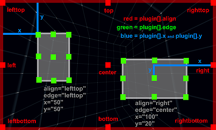
Illustration of the relations of "align", "edge", "x", "y", "width", "height":
 Examples
주 - <layer> 또는 <plugin> 요소는 내부적으로 완전히 동일한 요소이며 다른 이름으로 만 구성됩니다. 'plugin'대신 'layer'를 사용하는 것이 요소를 더 잘 설명하기 때문에 사용하는 것이 좋습니다. '플러그인'이라는 이름은 오래된 krpano 버전에서 나온 것이며 이전 버전과의 호환성을 위해서만 존재합니다.
<레이어 이름 = "..."
        유형 = "이미지"
        URL = "..."
        유지 = "false"를
        부모 = ""
        볼 = "true"를
        활성화 = "true"를
        handcursor = "true"를
        maskchildren을 = "거짓"
        scalechildren = "false"
        zorder = ""
        style = ""
        align = ""
        edge = ""
        x = ""
        y = ""
       회전 = "0.0"
        폭 = ""
        높이 = ""
        스케일 = "1.0"
        알파 = "1.0"
        자르기 = ""
        onovercrop = ""
        ondowncrop = ""
        BGCOLOR = "0x000000에서"
        bgalpha를 = "0.0"
        bgborder = "0"
        bgroundedge = "0"
        bgshadow = ""
        bgcapture = "false"
        onover = ""
        onhover = "
       " onout =" "
        의 onclick =" "
        ondown =" "
        onup =" "
        onloaded =" "
       />
| 속성 이름 | 전체 변수 이름 | 유형 | 기본값 |
| 이름 | 레이어 [이름] .name | 끈 | |
|---|---|---|---|
| 현재 레이어 / 플러그인 요소 의 이름입니다 ( 이름 메모 참조) . | |||
| 속성 이름 | 전체 변수 이름 | 유형 | 기본값 |
| 유형 | 계층 [이름]. 유형 | 끈 | "영상" |
| layer / plugin 요소의 유형입니다. 가능한 설정 : | |||
| 속성 이름 | 전체 변수 이름 | 유형 | 기본값 |
| url | 레이어 [이름] .url | 끈 | |
| 레이어 / 플러그인 이미지 파일의 경로 / URL입니다. ( URL 참고 사항 참조) 지원되는 파일 형식 : JPG, PNG, GIF 및 SWF (플래시 전용). Flash 및 HTML에 대한 다른 URL을 정의하려면 xml 장치 검사를 사용해야합니다. url.flash = "plugin.swf url.html5 = "plugin.js | |||
| 속성 이름 | 전체 변수 이름 | 유형 | 기본값 |
| 유지 | 레이어 [이름] .keep | 부울 | 그릇된 |
| 새 파노라마를로드 할 때이 레이어 / 플러그인 요소를 유지하거나 제거해야합니다. loadpano () 액션 도 참고하십시오 . | |||
| 속성 이름 | 전체 변수 이름 | 유형 | 기본값 |
| 명백한 | 레이어 [이름]. 시각 | 부울 | 참된 |
| layer / plugin 요소의 가시성. | |||
| 속성 이름 | 전체 변수 이름 | 유형 | 기본값 |
| 사용 가능한 | layer [name] .enabled | 부울 | 참된 |
| 레이어 / 플러그인 요소가 마우스 이벤트를 수신 할 수 있도록합니다. "false"로 설정하면 마우스 이벤트가 기본 요소로 라우팅됩니다. | |||
| 속성 이름 | 전체 변수 이름 | 유형 | 기본값 |
| 손수레 | 레이어 [이름] .handcursor | 부울 | 참된 |
| 마우스가 레이어 / 플러그인 요소 위에있을 때 손 모양 커서를 표시합니다. | |||
| 속성 이름 | 전체 변수 이름 | 유형 | 기본값 |
| 가면을 쓰다 | 계층 [이름] .maskchildren | 부울 | 그릇된 |
| true로 설정하면 부모 요소 외부에있는 모든 자식 요소가 클리핑되거나 마스크됩니다. HTML5 Safari / iOS 노트 - bargedge 및 bgshadow 설정 을 사용하여 가장자리와 그림자가 둥근 컨테이너 요소 에 maskchildren = true 를 사용 하면 자식 요소가 둥근 모서리에 잘리지 않습니다. 이것은 Safari 브라우저 (데스크탑 및 iOS)의 버그입니다. 다른 모든 브라우저는 정상입니다. | |||
| 속성 이름 | 전체 변수 이름 | 유형 | 기본값 |
| 국경 | 레이어 [이름] .zorder | 끈 | |
| 레이어 / 플러그인 요소의 딥 / 'Z'순서. 이 값은 임의의 문자열 또는 숫자 일 수 있습니다. zorder 설정이있는 모든 레이어 / 플러그인 요소는 지정된 값으로 정렬됩니다. 아무것도 설정되지 않은 경우 순서는 정의되지 않으며 브라우저의로드 / 완료 순서에 따라 다릅니다. 참고 - 이것은 겹치는 요소에 대한 중요한 설정입니다! HTML5 메모 - zorder는 음수 값이 아닌 0에서 100 사이의 값이어야합니다! | |||
| 속성 이름 | 전체 변수 이름 | 유형 | 기본값 |
| 스타일 | 레이어 [이름]. 스타일 | 끈 | |
| 하나 이상의 <style> 요소 에서 속성을로드하십시오 . 이것은 XML 코드를 줄이기 위해 사용할 수 있습니다. 더 많은 레이어 / 플러그인 또는 핫스팟 요소에 대해 동일한 속성을 <style> 요소의 한 위치에 함께 저장할 수 있습니다. 파이프로 스타일 이름을 구분, 하나 개 이상의 스타일을 지정하려면 | 문자. 주 - 스타일에 정의 된 속성은 layer / plugin / hotspots 정의에서 덮어 쓸 수 없습니다! 예: <style name = "style1"alpha = "0.5"scale = "0.5"... /> 스타일은 loadstyle (name) 액션 에 의해 동적으로로드 될 수도 있습니다 . | |||
| 속성 이름 | 전체 변수 이름 | 유형 | 기본값 |
| 정렬하다 | 레이어 [이름] .align | 끈 | |
| 화면상의 레이어 / 플러그인 요소의 정렬 / 원점 위치. 가능한 값 : lefttop, left, leftbottom, top, center, bottom, righttop, right, rightbottom - 또는 - no value (빈 값 또는 null) 설정하지 않으면 (기본값) krpano에 의한 위치 지정이 수행되지 않습니다. 플래시 / swf 플러그인). | |||
| 속성 이름 | 전체 변수 이름 | 유형 | 기본값 |
| 가장자리 | layer [name] .edge | 끈 | |
| 레이어 / 플러그인 요소의 가장자리 / 기준점. 가능한 값 : lefttop, left, leftbottom, top, center, bottom, righttop, right, rightbottom 또는 no 값 (비어 있음 또는 null) NOT (기본값)을 설정하지 않으면 align 속성 과 동일한 설정 이 사용됩니다. | |||
| 속성 이름 | 전체 변수 이름 | 유형 | 기본값 |
| x y | 레이어 [이름] .x 레이어 [이름] .y | String String | |
| 정렬 점에서 가장자리 점 까지의 거리 입니다. 절대 픽셀 값 또는 상대 (스크린 폭 또는 스크린 높이) 백분율 값일 수 있습니다. 주 - 오른쪽 / 아래쪽 정렬 요소의 경우이 거리는 오른쪽 / 아래쪽 측면에서 측정됩니다. | |||
| 속성 이름 | 전체 변수 이름 | 유형 | 기본값 |
| 회전하다 | 레이어 [이름] .rotate | 번호 | 0.0 |
| layer / plugin 요소를도 단위로 회전합니다. | |||
| 속성 이름 | 전체 변수 이름 | 유형 | 기본값 |
| 폭 높이 | 레이어 [이름] .width 레이어 [이름] .height | String String | |
| 레이어 / 플러그인 요소의 대상 크기 - 이미지가 해당 크기로 조정됩니다. 절대 픽셀 값 또는 상대 (스크린 폭 또는 스크린 높이) 백분율 값일 수 있습니다. 설정하지 않으면로드 된 이미지의 크기가 사용됩니다. 음수 값 - 음수 값을 크기로 사용하면 결과 크기는 부모 요소의 크기 (또는 부모가없는 경우 스테이지 크기)에서 지정된 음수를 뺀 값이됩니다. 또한 너비 또는 높이를 값으로 유지하고 다른 설정을 "prop"- width = "500"height = "prop로 설정 하여 특수 값 "prop " 를 사용하여 이미지의 너비 또는 높이를 조절할 수 있습니다 " ). | |||
| 속성 이름 | 전체 변수 이름 | 유형 | 기본값 |
| 규모 | 레이어 [이름] .scale | 번호 | 1.0 |
| 레이어 / 플러그인 요소의 크기 조정. | |||
| 속성 이름 | 전체 변수 이름 | 유형 | 기본값 |
| 알파 | 레이어 [이름]. 알파 | 번호 | 1.0 |
| 알파 값 / 레이어 / 플러그인 요소의 투명도. 0.0 = 완전 투명, 1.0 = 완전 가시 참고 - 0.0으로 설정된 경우에도 요소가 그대로 있고 클릭 할 수 있습니다. 완전히 숨기려면 visible 속성을 false로 설정해야합니다! | |||
| 속성 이름 | 전체 변수 이름 | 유형 | 기본값 |
| 자르기 onovercrop ondowncrop 자르기 | layer [name] .crop 레이어 [name] .onovercrop 레이어 [name] .ownowncrop | 문자열 문자열 문자열 | |
| 원본 이미지의 직사각형 영역을 잘라내거나 자릅니다. serval 이미지 요소에 단 하나의 이미지 만 사용하면 유용합니다. onovercrop / ondowncrop - 마우스 오버 및 마우스 버튼 다운 상태를위한 다른 자르기 영역. 통사론: 자르기 = "x 위치 | y 위치 | 너비 | 높이" | |||
| 속성 이름 | 전체 변수 이름 | 유형 | 기본값 |
| 부모의 | 계층 [이름]. 부모 | 끈 | |
| 현재 레이어 / 플러그인을 다른 레이어 / 플러그인 또는 핫스팟 요소의 하위 요소로 지정하십시오. 할당 된 레이어 / 플러그인은 부모 요소 내부에서 정렬됩니다. 사전 정의 된 두 개의 특수 부모 요소가 있습니다.
구문 : 상위 계층 / 플러그인의 이름 만 사용하십시오. parent = "name"또는 상위 요소 여야하는 레이어 / 플러그인 또는 핫스팟의 전체 경로 / 이름 : parent = "레이어 [이름]" parent = "핫스팟 [이름]"또는 파노라마 / 파노라마 요소를 파노라마 영역 외부 또는 후면에 정렬하려면 다음 단계를 따르세요. parent = "STAGE" parent = "눈알" 참고 - 왜곡 된 핫스팟은 현재 부모로 사용할 수 없습니다! | |||
| 속성 이름 | 전체 변수 이름 | 유형 | 기본값 |
| 스케일 러스 | 레이어 [이름] .scalechildren | 부울 | 그릇된 |
| 현재 레이어 / 플러그인 요소의 크기가 조정될 때 상위 레이어 에 의해 할당 된 하위 레이어 / 플러그인 요소도 크기를 조정해야합니다. | |||
| 속성 이름 | 전체 변수 이름 | 유형 | 기본값 |
| bgcolor | 레이어 [이름] .bgcolor | int | 0x000000 |
| 컨테이너 요소의 배경색입니다 ( type = container 인 경우에만 사용 가능 ). | |||
| 속성 이름 | 전체 변수 이름 | 유형 | 기본값 |
| 불알 | 레이어 [이름] .bgalpha | 번호 | 0.0 |
| 컨테이너 요소의 배경색 투명도 / 알파입니다 ( type = container 일 경우에만 사용 가능 ). | |||
| 속성 이름 | 전체 변수 이름 | 유형 | 기본값 |
| Bgborder | 레이어 [이름] .bgborder | 끈 | "0" |
| 유형 = 컨테이너 레이어 요소 주위에 테두리를 추가하십시오 . 통사론: bgborder = "너비 색상 알파" 매개 변수 :
| |||
| 속성 이름 | 전체 변수 이름 | 유형 | 기본값 |
| 지저분한 | 레이어 [이름] .bgroundedge | 끈 | "0" |
| 컨테이너 배경 색상 모양의 둥근 모서리를 정의하십시오. 값은 가장자리 라운딩 반경을 픽셀 단위로 설정합니다. 4 개의 값을 설정할 수 있습니다. 각 값은 공백 문자로 구분됩니다. 왼쪽 위, 오른쪽 위, 오른쪽 아래, 왼쪽 아래 순서로 주어진다. 왼쪽 하단을 생략하면 오른쪽 상단과 같습니다. 오른쪽 하단을 생략하면 왼쪽 상단과 같습니다. 오른쪽 위를 생략하면 왼쪽 위와 동일합니다. | |||
| 속성 이름 | 전체 변수 이름 | 유형 | 기본값 |
| bgshadow | 레이어 [이름] .bgshadow | 끈 | |
| type = container 레이어 요소 뒤에 그림자를 추가합니다 . 기본 구문 (Flash 및 HTML5에서 지원되는 5 개의 매개 변수) : bgshadow = "xoffset yoffset 블러 컬러 알파" 고급 구문 (6 개 이상의 매개 변수, HTML5에서만 지원됨) : bgshadow = "xoffset yoffset 흐림 확산 색상 알파 삽입, ..." 매개 변수 :
| |||
| 속성 이름 | 전체 변수 이름 | 유형 | 기본값 |
| bgcapture | layer [name] .bgcapture | 부울 | 그릇된 |
| 컨테이너 요소의 배경에서 마우스 이벤트를 캡처합니다 ( type = container 및 bgalpha> 0.0 인 경우에만 사용 가능 ). | |||
| 속성 이름 | 전체 변수 이름 | 유형 | 기본값 |
| 끝내다 | 레이어 [이름] .onover | 액션 이벤트 | |
| 마우스가 layer / plugin 요소 위로 움직일 때 호출되는 액션 / 함수. | |||
| 속성 이름 | 전체 변수 이름 | 유형 | 기본값 |
| 온 후에 | 레이어 [이름] .onhover | 액션 이벤트 | |
| 마우스가 레이어 위에 머무르거나 레이어 / 플러그인 요소 위에있을 때 간격 (초당 15 회)으로 호출되는 액션 / 함수. | |||
| 속성 이름 | 전체 변수 이름 | 유형 | 기본값 |
| ~에 | layer [name] .onout | 액션 이벤트 | |
| 마우스가 layer / plugin 요소 밖으로 이동할 때 호출되는 액션 / 함수. | |||
| 속성 이름 | 전체 변수 이름 | 유형 | 기본값 |
| onclick | 레이어 [이름] .onclick | 액션 이벤트 | |
| layer / plugin 요소를 마우스로 클릭 할 때 호출되는 액션 / 함수. | |||
| 속성 이름 | 전체 변수 이름 | 유형 | 기본값 |
| 온 다운 | 레이어 [이름] .ondown | 액션 이벤트 | |
| 레이어 / 플러그인 요소에서 마우스 버튼을 누를 때 호출되는 액션 / 함수입니다. | |||
| 속성 이름 | 전체 변수 이름 | 유형 | 기본값 |
| 어른 | 레이어 [이름] .onup | 액션 이벤트 | |
| 이전에 누른 마우스 버튼을 놓을 때 호출되는 액션 / 함수입니다. | |||
| 속성 이름 | 전체 변수 이름 | 유형 | 기본값 |
| 부하가 걸린 | layer [name] .onloaded | 액션 이벤트 | |
| 레이어 / 플러그인 이미지의로드가 완료 될 때 호출되는 액션 / 함수. | |||
"align", "edge", "x", "y", "width", "height"관계의 그림 :
scene 안에 layer 태그를 삽입하고 값을 입력한다.
<layer name="logo" url="logoimage.png" align="rightbottom" x="120" y="120" onclick="openurl('http://naver.com');"/>
이 부분은 로고 자리 세팅
<layer name="imagebar" type="container" width="100%" height="200" align="leftbottom" bgcolor="0x000000" bgalpha="0.5">
<layer name="item1" url="image1.png" align="left" x="10" y="-500" />
<layer name="item2" url="image2.png" align="left" x="110" y="-500" />
<layer name="item3" url="image3.png" align="left" x="210" y="-500" />
</layer>
이 부분은 각자 자리에 세팅
<scene name="scene_DSC_3873_Panorama" title="DSC_3873 Panorama" onstart="" thumburl="panos/DSC_3873_Panorama.tiles/thumb.jpg" lat="" lng="" heading="">
<view hlookat="0" vlookat="0" fovtype="MFOV" fov="120" maxpixelzoom="2.0" fovmin="70" fovmax="140" limitview="auto" />
<preview url="panos/DSC_3873_Panorama.tiles/preview.jpg" />
<image>
<cube url="panos/DSC_3873_Panorama.tiles/pano_%s.jpg" />
<mobile>
<cube url="panos/DSC_3873_Panorama.tiles/mobile_%s.jpg" />
</mobile>
</image>
<layer name="logo" url="logoimage.png" align="rightbottom" x="120" y="120" onclick="openurl('http://naver.com');"/>
<layer name="imagebar" type="container" width="100%" height="200" align="leftbottom" bgcolor="0x000000" bgalpha="0.5">
<layer name="item1" url="image1.png" align="left" x="10" y="-500" />
<layer name="item2" url="image2.png" align="left" x="110" y="-500" />
<layer name="item3" url="image3.png" align="left" x="210" y="-500" />
</layer>
<!-- place your scene hotspots here -->
<hotspot name="spot2" style="skin_hotspotstyle" ath="-33.384" atv="-11.352" linkedscene="scene_dsc_3873_panorama" />
</scene>